Successful OOH campaigns
Why this billboard works—and what it teaches us about effective OOH design
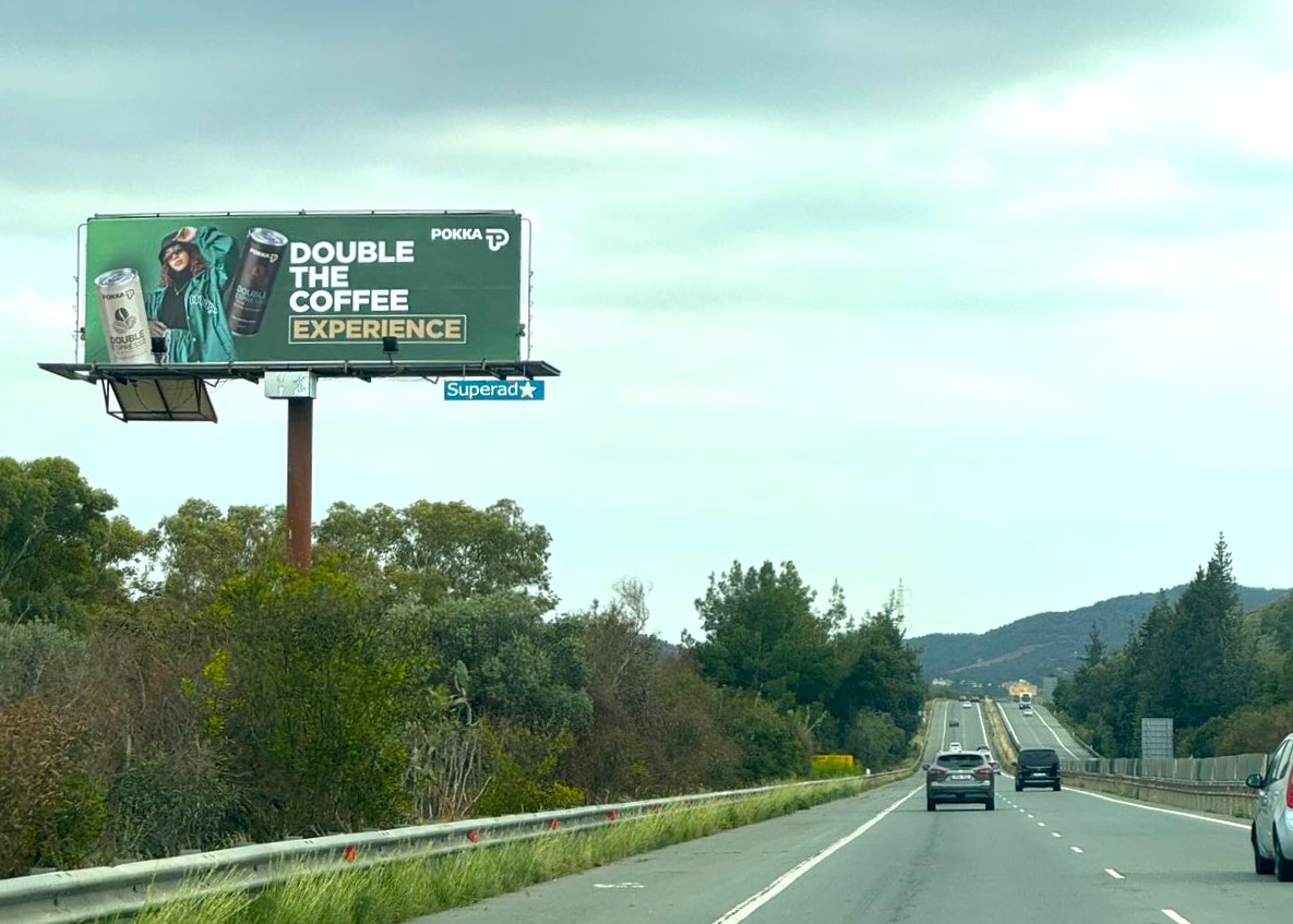
Seen here on our high-traffic network: POKKA’s “Double the Coffee Experience” campaign is a textbook example of strong billboard design.
✅ Bold, readable typography – Short, punchy message that can be absorbed in seconds.
✅ High contrast & color blocking – Ensures clarity and visibility even from a distance.
✅ Product-focused imagery – Clear visuals of the brand and offering.
✅ Minimalist layout – No clutter, no confusion—just clean, direct communication.
At high speeds, simplicity wins. This is how you make an impression before the driver passes by. OOH isn’t just about being seen—it’s about being remembered.